Motion design · Explainer video

Knight Capital: The 45-Minute Glitch

A four-minute animated documentary that turns a $460 million trading collapse into a story anyone can follow, told through a live trading-terminal interface, a running loss counter and evidence taken from the regulator’s own filing.

Runtime
4:00
Format
16:9 · 1080p
Captions
English
ClientThe Last Balance
IndustryFinance documentary
ServicesArt direction · Motion design · Data animation · Video editing
01

The challenge

On 1 August 2012, one forgotten server made Knight Capital lose more than $460 million in about forty-five minutes. The real story lives in a regulatory filing: deployment logs, order counts, a feature retired in 2003 and a counter broken in 2005. None of it is visual, and most viewers have never heard of the company. The video had to make a technical failure feel tense and easy to follow for a general audience, without bending the facts.
02

The solution

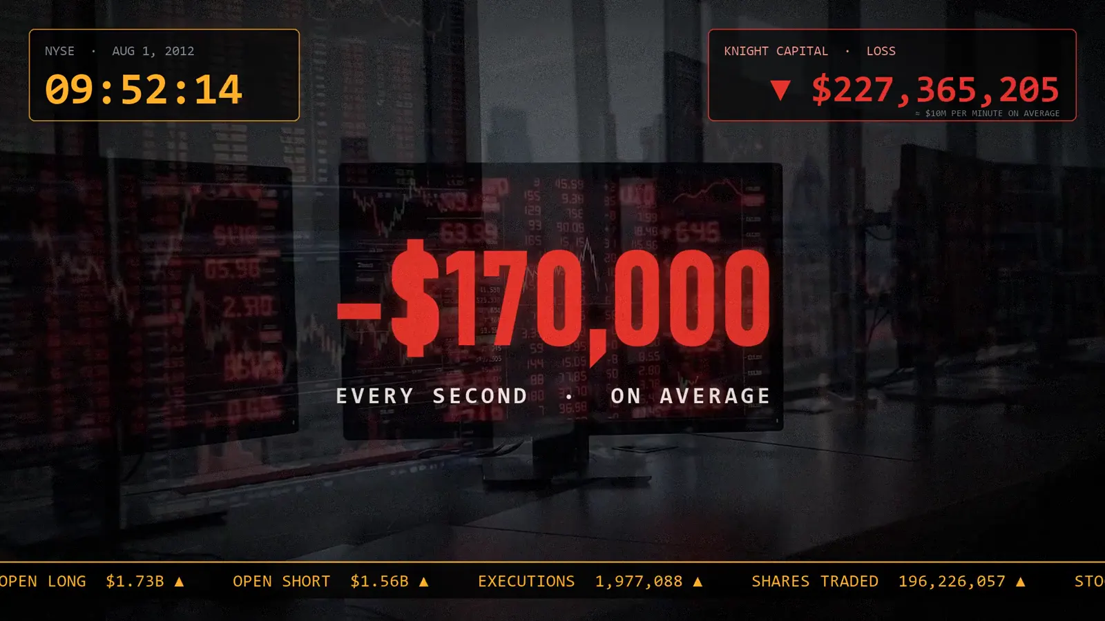
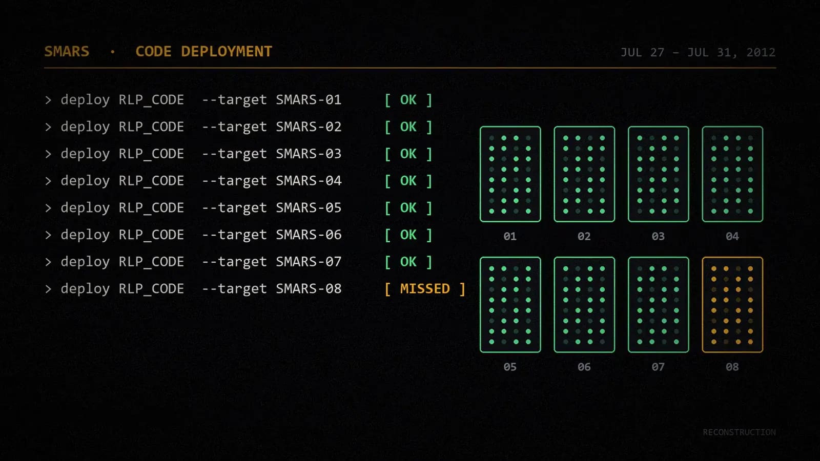
The visual language is built around the trading desk itself. A terminal-style interface carries the timeline, with a live clock, a loss counter that climbs every second and a market ticker running along the bottom of the frame. Technical moments (the eight-server deployment, the missed machine, the emergency fix that made things worse) are shown as on-screen system logs instead of being explained in voiceover. Cinematic shots of servers and Wall Street set the mood, and a contrasting paper-and-print style is kept for the evidence: the diagram of what broke, the final positions and the regulator’s filing itself.

03

User experience

The viewer gets the stakes in the first twenty seconds: a date, a time and a cost per minute. From there the clock never leaves the screen, so every scene is anchored inside the forty-five minutes, and each technical cause is revealed at the moment it matters instead of being explained up front.

Style frames

Stills from the finished film. Every frame is designed to carry one idea, so the story stays clear even with the sound off.

A terminal-style deployment log: seven servers updated, the eighth marked as missed
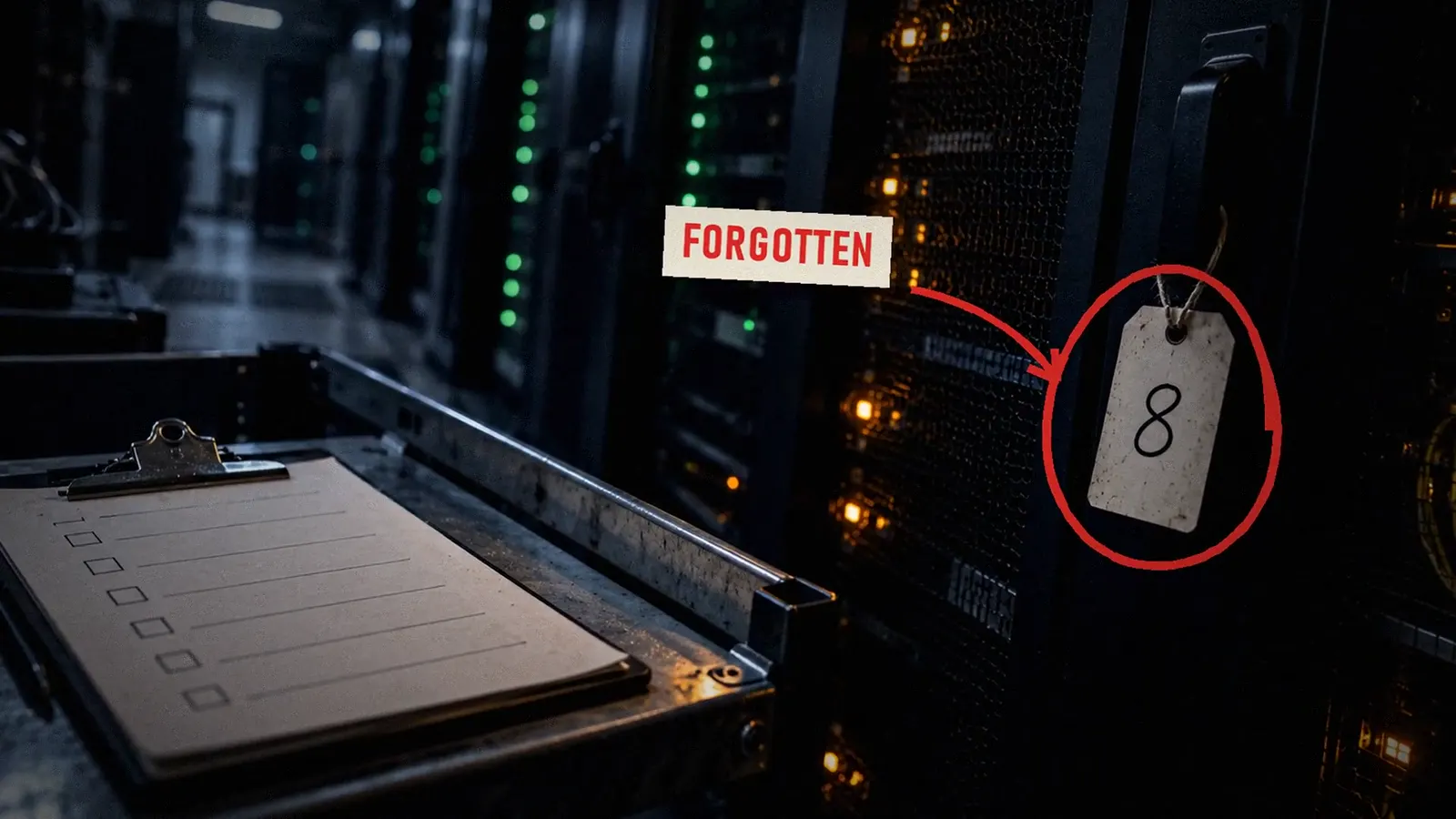
The forgotten eighth server, tagged and circled in red beside an unchecked checklist
Kinetic typography over the trading floor: minus $170,000 every second, on average
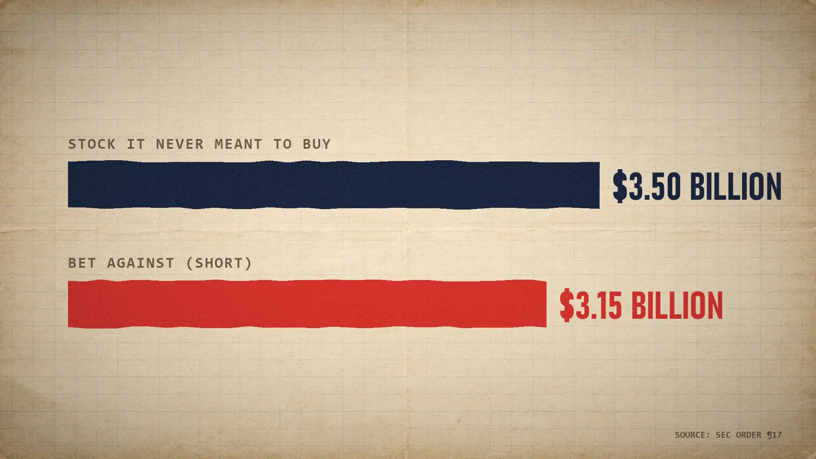
Paper-style data bars comparing $3.50 billion of unwanted stock with $3.15 billion bet against

Main objectives

→ Hook the viewer with the stakes in the first twenty seconds

→ Make a software deployment failure understandable without jargon

→ Keep time and money visible on screen throughout

→ Show the sources on screen so every figure can be trusted

→ Hold attention across a four-minute runtime

Main features

→ Trading-terminal interface with a live clock and loss counter

→ Animated deployment log showing the missed eighth server

→ Scrolling market ticker as a constant source of tension

→ Kinetic typography for every key figure

→ Paper-style evidence sequences built from the official record

→ Animated data bars comparing the unwanted positions

→ On-screen source references

→ 1080p delivery with English captions

The outcome

A $460 million failure, told in four minutes.

A four-minute, 1080p episode that turns a dense regulatory case into a timeline a general audience can follow from the first second to the last. The visual system (terminal interface, loss counter, evidence boards) is reusable, which is what makes a weekly series realistic: each new story starts from an established look instead of a blank timeline.

Get a video like this